Your website may have great content. But small design elements still guide user behavior. Social media icons are one of those elements. They look simple. Yet they quietly connect your website with your social presence.
Many businesses add these icons just to fill space in a footer. But they can do much more. When placed correctly, they guide visitors to explore your brand further. One click can move someone from your website to your social profile.
But there is a catch. If icons are used incorrectly, they can create confusion. Sometimes, they even break platform branding rules. When used properly, these icons feel natural. They help people discover your brand beyond your website. And that small action can slowly build stronger online connections.
Make your social presence seamless and effective.
Let Practina help you turn engagement into results.
Get Started Now!Social Media Icons
Social icons or logos are small symbols that represent brands. You often see them on websites, blogs, or emails. They help users reach your social profiles quickly.
Each platform has its own icon. Facebook has the blue “f”. And YouTube shows the red play button. When people see these icons, they immediately recognize the platform.
These icons make navigation easier. Users don’t need to search for your profile. They can simply click the icon. And check your social accounts.
Social Media Logos Need Proper Use: The Basic Guidelines
Using social media logos in your content may look simple. But there are rules behind it. These logos represent the platform’s brand identity. So they must appear correctly. No matter where you use them.
Many brands ignore these rules. And create their own versions. That can create problems later.
Platforms protect their logos as registered trademarks. Because of that, they expect you to follow their branding guidelines. When you follow the correct practices, your content looks more professional. Also, it keeps your brand safe from policy or trademark issues.
▪ Always Use Official Social Media Logo Assets
You should always download logos from the platform’s official brand resource page. These files follow the correct designs. And you don’t have to brood about proportions and quality standards.
Some people copy icons from third-party websites. That is not recommended. Those icons may be outdated, low quality, or slightly modified. Sometimes, platforms update their logos. Or make small design adjustments. If you use official assets, you always stay aligned with the latest version.
This also keeps your website, emails, and presentations visually consistent.
▪ Use The Exact Platform Colors
Every social media platform has its own brand colors. These colors help people recognize the platform quickly.
For example, the blue in LinkedIn is not the same as the blue in Facebook. Even a color shade change can affect how the logo looks.
Because of this, you should never adjust the logo color to match your website theme. Platforms clearly provide the exact color codes you should use.
If the colors do not fit your design, you still have options. Most platforms offer monochrome or white versions of their icons.
▪ Leave Enough Space Around Social Media Logos
Social media logos should never appear crowded in a design. They need space around them. This space is often called clear space in branding guidelines. It simply means no text, image, or logo should sit too close. When there is enough space, the logo becomes easier to recognize.
Spacing also improves the overall look of your layout. It keeps your design clean.
Most platforms define the minimum spacing you should maintain. Following it ensures proper visibility of the icon.
▪ Keep The Logo Shape and Size Correct
Resizing logos is common. You might do it for designing pages or marketing materials. But you must always keep the original shape and proportion. Stretching or squeezing the logo changes its shape. It happens when the image is resized without maintaining proportions.
Hold the Shift key while resizing. It can keep the logo balanced. Most design tools allow you to do this.
Also, avoid making icons extremely small. Very small icons become difficult to see and lose clarity.
▪ Use Simple Calls To Action With Icons
Social media icons work better when you guide users clearly. That is where a simple call-to-action becomes helpful. For example, you can write “Follow us on TikTok”. Or you can say “Connect with us on LinkedIn”.
Sometimes you may place several icons together in one section. In that case, a simple line like “Follow us on social media” works well. These small prompts encourage users to follow your profiles.
▪ Your Brand Is The Main Focus
Social media icons should support your content, not dominate it. Your brand message should always remain the main focus.
Icons work best in areas like website footers or page endings. They guide users without distracting them from your content. When the brand stays central, the message becomes clearer. It also helps build stronger recognition for your business.
▪ Do Not Change Social Media Logos
This is where many brands make mistakes. Social media logos are registered trademarks. So they should never be modified.
You should not rotate them or change their colors. You should also avoid adding effects or design elements. Even small changes can break platform branding rules. If the logo color does not match your design, use the monochrome version. Most platforms provide these versions for flexible layouts.
Social Network Icons: Platform Specifics
Placing a logo is not just about design. Platforms expect their logos to be used in a specific way.
Things like spacing, size, and colors matter. If these rules are ignored, the logo may lose its identity or create confusion.
The Facebook logo uses a white lowercase “f” on a blue background. It’s often called Facebook Blue.
Usage
The logo should always appear in its original and complete form. In many cases, it appears with text such as Follow us on Facebook or Like us on Facebook. This helps people clearly understand the action being suggested.
Clear Space
Spacing around the logo is important. There should be a clear space equal to about half the width of the logo. This prevents the logo from looking crowded.
Restrictions
- The logo color should never be changed.
- Gradients, shadows, or 3D styles should not be applied.
- The logo should also not be used in ways that suggest an official partnership.
Official Assets
The safest way to get the logo is from Meta’s official brand resource center.
YouTube
The YouTube logo combines the YouTube wordmark with the red play button icon. It represents video and media content.
Logo Versions
The logo comes in multiple versions:
- Full color
- Black
- White
The full-color logo works best on light backgrounds. The white version is usually used on darker backgrounds.
Clear Space
The space around the logo should roughly match the size of the play button triangle. This keeps the logo visually clear.
Restrictions
- Never stretch or distort the logo.
- Don’t use it inside sentences or phrases.
- It should also not be used in ways that imply YouTube endorsement.
Linking Requirement
If the YouTube logo appears on a website or app, it should normally link to a YouTube channel or video.
Instagram’s logo is the colorful gradient camera icon seen across the platform.
Usage
The recommended version is the full gradient logo on a white background. This version keeps the brand vibrant and recognizable.
Clear Space
There should be space around the logo equal to the height of the letter “I” in Instagram.
Restrictions
- The gradient should never be changed.
- Don’t rotate, stretch, or recolor the logo.
- It should also not appear in negative contexts.
Permissions
Large advertising uses may require approval from Instagram.
TikTok
TikTok’s logo is a stylized musical note with cyan and red accents. It reflects the platform’s creative and energetic nature.
Usage
The full-color version should be used whenever possible. The logo usually appears on black or white backgrounds.
Clear Space
Spacing around the logo should roughly equal the height of the letter “T” in TikTok.
Restrictions
- The logo should not be recolored, rotated, or distorted.
- Don’t use it with busy backgrounds that make it difficult to see.
Attribution
If TikTok content appears in the media, proper attribution should be given.
Snapchat
Snapchat’s logo features the well-known ghost icon on a bright yellow background.
Usage
The ghost icon must remain white with a black outline. And the background should stay Snapchat Yellow.
Clear Space
Spacing around the logo should be equal to the height of the ghost icon.
Restrictions
- Never rotate or redesign the ghost.
- The logo should also not appear larger than your own brand logo in marketing materials.
Special Rule
Snapchat recommends not placing its logo alongside many other social media icons.
X
The X logo uses a simple “X” symbol. It reflects the platform’s minimalist identity.
Usage
The logo usually appears in black or white, depending on the background.
Clear Space
Spacing should be about 150% of the logo width.
Restrictions
- You can not modify or record the logo.
- Older Twitter bird logos should also not be used.
Pinterest’s logo features a white “P” inside a red circle.
Usage
The logo should appear in the official Pinterest red color whenever possible.
Clear Space
Spacing around the logo should equal the height of the “P”.
Restrictions
- You can’t stretch or recolor the logo.
- Don’t use it in ways that suggest Pinterest endorses another brand.
Reddit’s logo includes the friendly Snoo character. It is often shown alongside the Reddit wordmark.
Usage
The preferred version is the full-color logo with the orange background.
Clear Space
Spacing around the logo should equal the height of the Snoo character.
Restrictions
- Snoo should never be altered.
- The colors and proportions should remain exactly as defined.
LinkedIn’s logo features the LinkedIn wordmark with the “in” inside a blue square.
Usage
The full-color version should be used whenever possible.
Clear Space
Spacing around the logo should equal twice the width of the letter “i”.
Restrictions
You can not stretch, recolor, or distort the logo.
Threads
Threads uses a stylized “@” symbol as its logo. It portrays its connection to Instagram.
Usage
The logo is usually displayed on black or white backgrounds.
Logo Lockup & Clear Space
Sometimes the icon appears with the word “Threads”. This is called a logo lockup.
The spacing between the icon and text should remain unchanged.
Restrictions
Don’t modify or distort the logo.
Social Icons Color System
Each social media platform maintains a defined color system. Here are their official colors and HEX codes for digital use
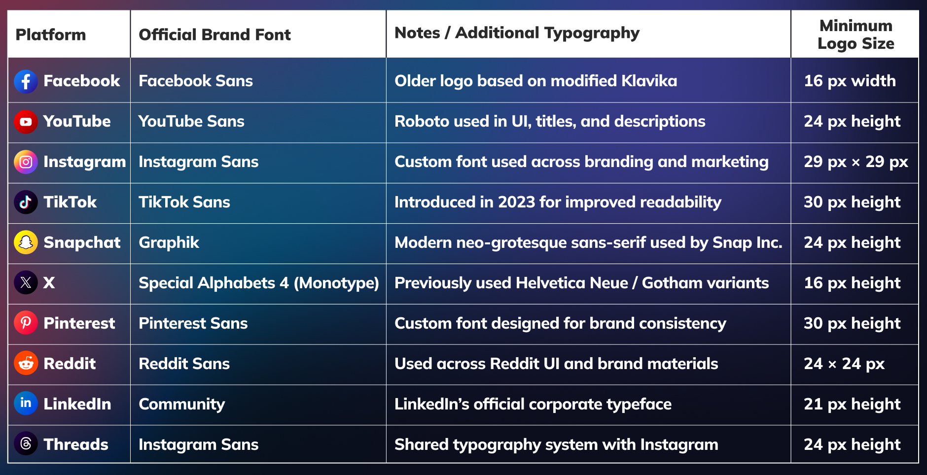
Social Media Typography & Minimum Logo Size System
Official typeface and minimum logo sizing rules to preserve readability and brand consistency.
Conclusion
Small elements often shape how complete your website feels to visitors. When design details work well, people move smoothly across different parts of your brand.
Social media icons help create that connection between your website and social profiles. They quietly guide people who want to explore more about you.
And when your profiles stay active with good content, that connection becomes stronger. Tools like Practina AI can help with that. It supports content creation, reputation management, and more, helping you grow a more consistent and recognizable personal brand online.
FAQs
Q: How Does a Social Icon Help Visitors Connect With My Brand?
A: A social icon helps visitors quickly recognize your social profiles. This makes it easier for them to connect with your brand and follow your updates.
Q: Where Should I Place Social Networks Icons on My Website?
A: You should place social networks icons where they feel natural. Footers, headers, and blog endings usually work well.
Q: Can I Use Free Social Media Icons Download Websites for My Design?
A: Yes. But you should be careful. Always check if the icons match the platform’s latest design. Using reliable sources helps you avoid outdated or modified icons.
Q: What Does the Instagram Insights Icon Represent?
A: It helps you view performance details of your content. You can see how people interact with your posts. This makes it easier to understand what works for your audience.
Q: Should I Link My Social Icons Only To Active Profiles?
A: Yes. You should link them only to active profiles. Visitors expect to see recent activity when they click. Inactive pages can create a weak impression of your brand.
Q: How Many Social Media Icons Should I Add to My Website?
A: You should only add platforms you actively use. Too many icons can make the layout look crowded.